Northwest CPAs
Logo Design
Project Overview
Northwest CPAs (NWCPA) is an accounting firm just north of Portland, OR in the small, sleepy town of Ridgefield, WA. Their talented team of bookkeepers and accountants partner with a wide variety of companies in the region—dealing out large doses of financial peace of mind.
NWCPA wanted a mark that spoke both to the financial nature of their work as well as to the beauty surrounding them in the northwest.
Accounting is not generally considered on of the sexier professions, but NWCPA had a story to tell and approached us to help craft a new mark that would help add a bit of modernity to their brand.

In all we developed 12 marks that explored different aspects of accounting, technology, and nature.
A Solid Strategy + the Art of Listening
From early in our discussions with the managing principles of the firm we knew that they had a rough idea of what their story could be. They had struggled working with a series of other designers on the same project—feeling that their vision wasn’t being completely realized in the work produced. We took the time to quietly listen to their story, how they envisioned their brand, and what their goals were for the next few years. We also spent time diving into the core mission of the group as well as trying to understand the team.
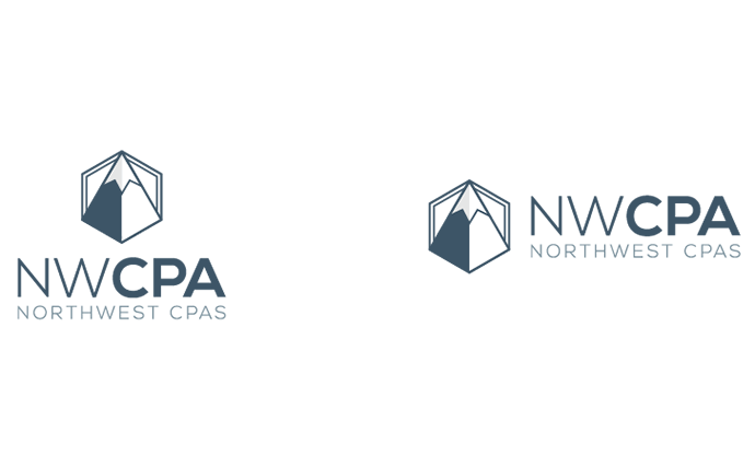
Recurring patterns regarding the technical nature of their work and a passion for the northwest consistently rose to the top of our conversations. This gave us a direction to move in and we set about exploring the intersecting lines between the financial world and nature (you’d be surprised just how many connections you can make). In the end, our logo design drew deeply from those talks and incorporated both the majesty of the northwest mountains as well as the precise nature of their work through a logotype that incorporated a dual symbolism system (mountain and pencil tip).
The Final Mark

The final logos utilized a dual symbol system comprising elements of both nature and the technical nature of the NWCPA business model.
Outcome
- A new identity that blended both the analytical aspects of their business with the beautiful nature that surrounds their geographical location.
Team
Erin Lynch: Strategy, Design, and Production
Brian Ferdinand: Strategy