Gridwork AE Rebrand
StoryBrand Messaging, Brand Strategy, Renaming, Visual Identity, Website Redesign
Gridwork AE Project Overview
Gridwork AE is a Portland architecture and engineering firm known for bringing clarity, responsiveness, and practical problem-solving to complex building projects. Formerly Livermore Architecture & Engineering, the firm needed a new name and brand identity that better reflected who they are today: a collaborative, cost-conscious team with integrated architecture and structural engineering expertise. Shop led the renaming and rebrand process, developing a new name, logo, messaging, visual system, and light website reskin to create a brand that feels clear, authentic, and aligned with the way Gridwork works.
The Challenge
Gridwork AE had grown into a more integrated, collaborative architecture and engineering firm, but its existing name and brand no longer fully reflected the clarity, practicality, and team-based approach that defined the business.
The challenge was to create a new identity that honored the firm’s experience and credibility while better expressing who they had become: a responsive, thoughtful partner capable of navigating complex projects with confidence and precision.
The rebrand needed to do more than update the visuals. It needed to establish a new name, sharpen the firm’s positioning, and build a brand system that felt authentic to the team and aligned with how they work.
Strategy / Process
The team understood that this rebrand needed more than a visual refresh—it required a deeper look at the brand’s history and a clear vision for its future under new leadership. This kind of shift called for a thoughtful process that aligned naming, messaging, and design, ensuring the final brand reflects what Gridwork AE is and how the team works.
Key Deliverables
Naming
We led the team through a structured renaming process, helping them explore and define a name that better reflects who they’ve become as an integrated architecture and engineering firm.
Brand Messaging
Through a structured branding process, we clarified the firm’s positioning and messaging, drawing on StoryBrand principles to ensure the new brand communicates their values, working style, and strengths with clarity and consistency.
Identity + Rollout
We translated the strategy into a cohesive visual identity system—including logo design, identity design, and web design—and developed launch materials to help the new brand show up clearly across every touchpoint.
Messaging Strategy
Using the StoryBrand framework, we helped Gridwork AE clarify their positioning, refine their message, and strengthen the rebrand.
One of the most important parts of the Gridwork AE rebrand was the messaging work we developed together using the StoryBrand framework. Over several collaborative sessions, we worked with the team to clarify who they are, what makes their approach distinctive, and how to express that clearly and confidently in language. That process helped surface the values, personality, and practical strengths that were already present within the firm, but not yet fully reflected in the brand. By slowing down and working through the brand script as a team, we were able to create stronger alignment around their positioning, sharpen the core messages that would guide the rebrand, and build a foundation for both the visual identity and future website content.
In-Depth Strategy
- 5 In person Team Strategy Sessions
- 30+ Email Discussions
- 15 Total Hours of Strategy Discussion
- 35 Deep Prompting and AI Refinement Sessions
- 10 Hours of Internal Planning Sessions
Which Led To
A 75 page brand messaging guide covering external client marketing messaging, social media messaging, one-liners, tag lines, sales scripts, sound bites, marketing prompts for AI, and a series of other tools designed to support brand messaging.
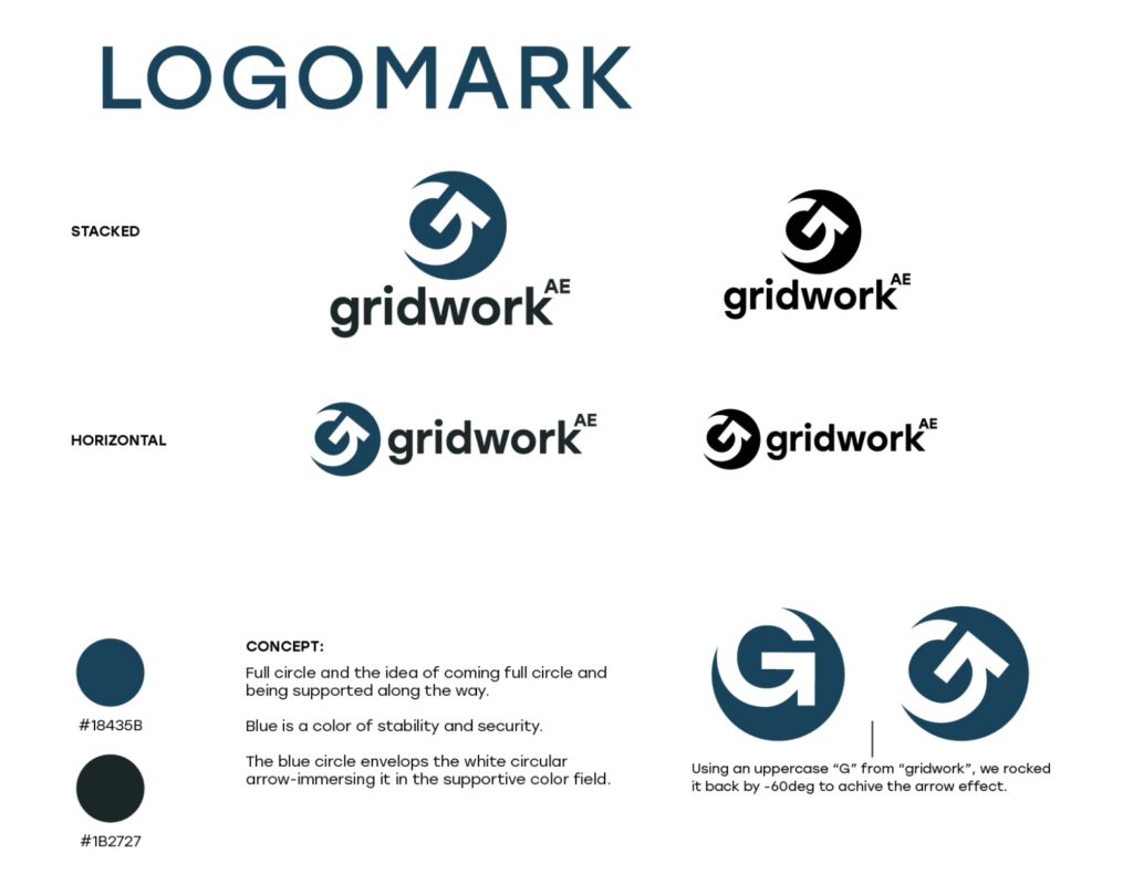
Visual Identity System
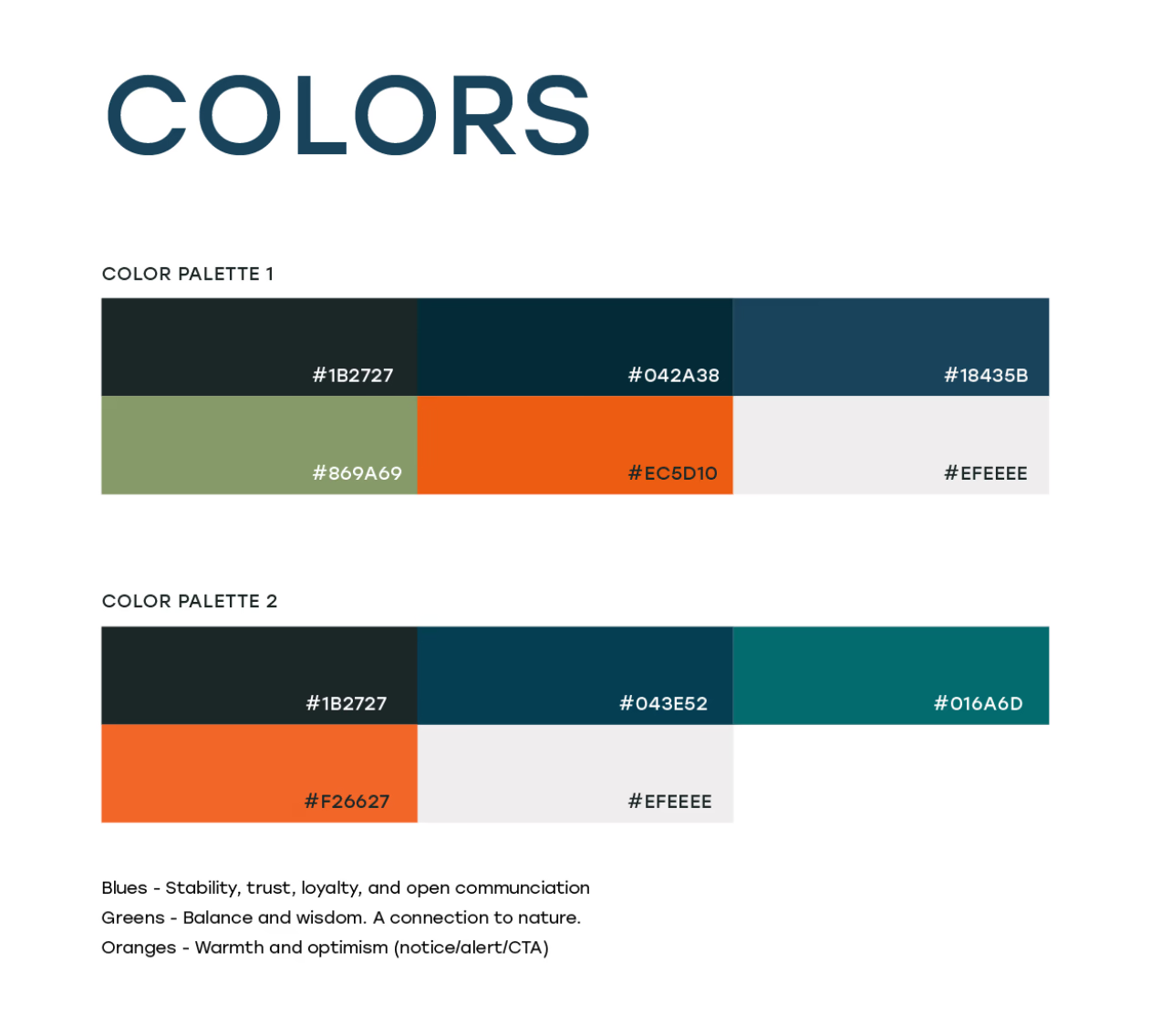
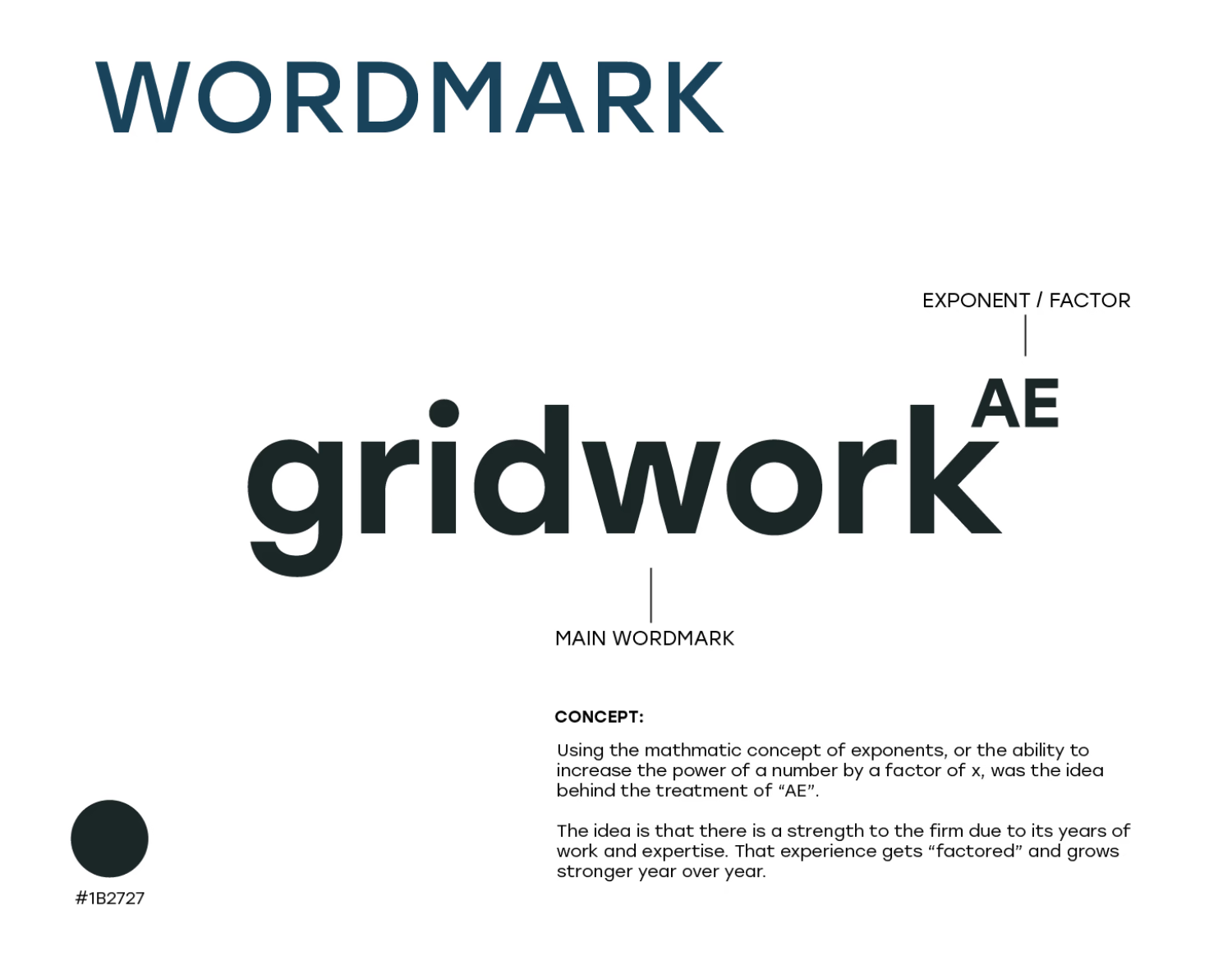
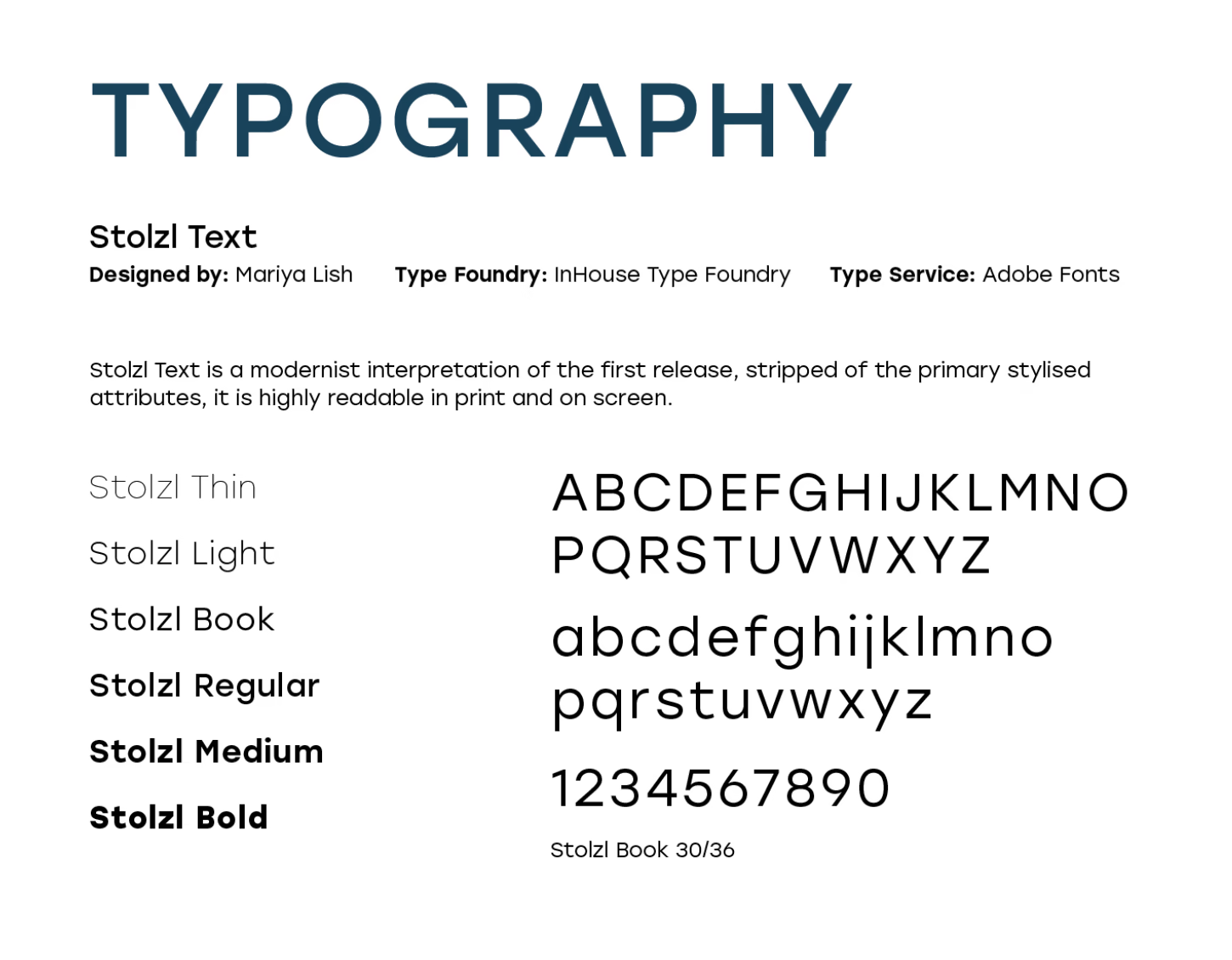
We created a logo, typographic system, and muted regional palette designed to reflect Gridwork AE’s clarity, professionalism, and collaborative approach.
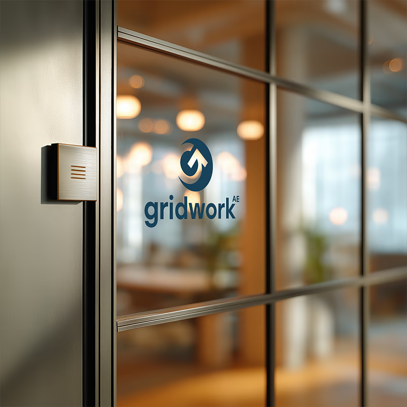
The visual identity for Gridwork AE was designed to reflect the firm’s clear, thoughtful, and highly collaborative approach to its work. At the center of the system is a custom “G” mark whose reverse rotation creates the impression of a circular arrow, suggesting movement, continuity, and guidance. That gesture speaks to the way Gridwork AE supports and educates clients throughout the full project lifecycle, helping them navigate complex decisions with clarity and confidence. The surrounding visual system was intentionally kept clean and understated, allowing the identity to feel modern, professional, and durable rather than overly stylized. A muted color palette was selected to reinforce that tone while also bringing in a subtle sense of the Northwest landscape, giving the brand a grounded quality that feels both contemporary and regionally connected.
![]()
Gridwork AE logo marks early on in development. The shop team explored several visual directions based on core ideas that surfaced during our brand strategy meetings early on in the project.
Key Deliverables
Naming + Strategy
A new name and messaging framework to support the new brand position.
– Naming Strategy
– StoryBrand Brand Strategy Sessions
– Brand Messaging
Identity System
A cohesive visual language for the brand across print and digital.
– Logo System
– Color Palette
– Font Selections
Rollout Assets
Core applications that helped bring the brand to life in use.
– Business Card
– Letterhead Design
– Website Reskin
– Email Signatures
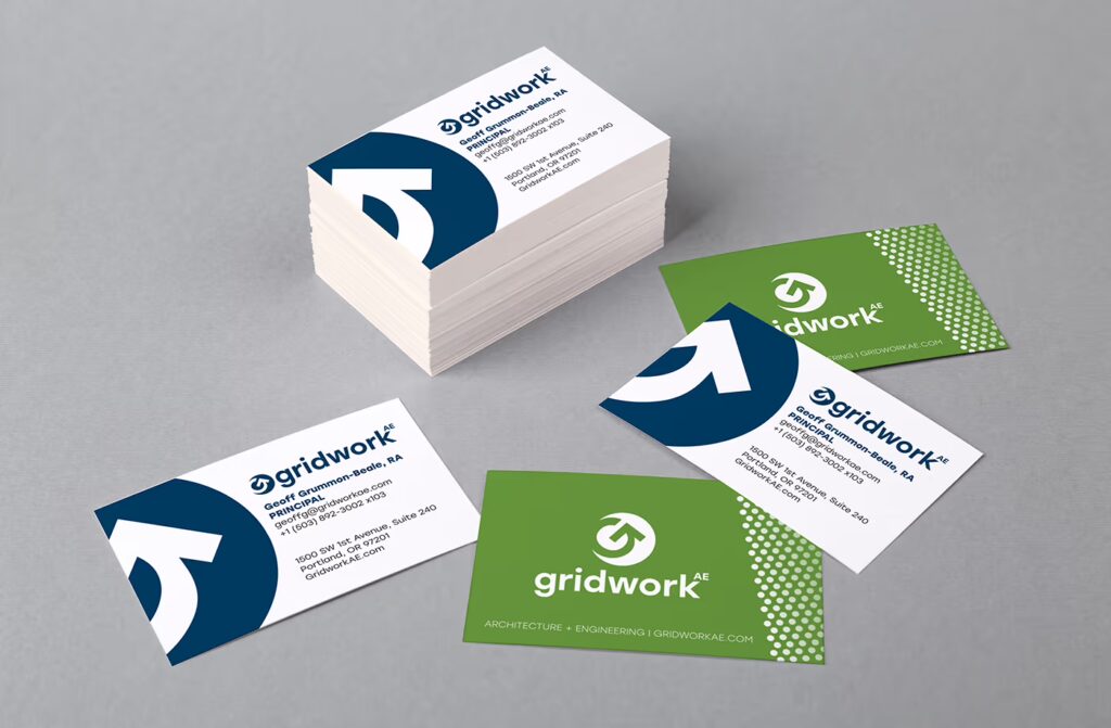
Business Cards
The Gridwork AE business cards featured three separate colorways for the back of the card, allowing staff to have some variation and choice in their card design.
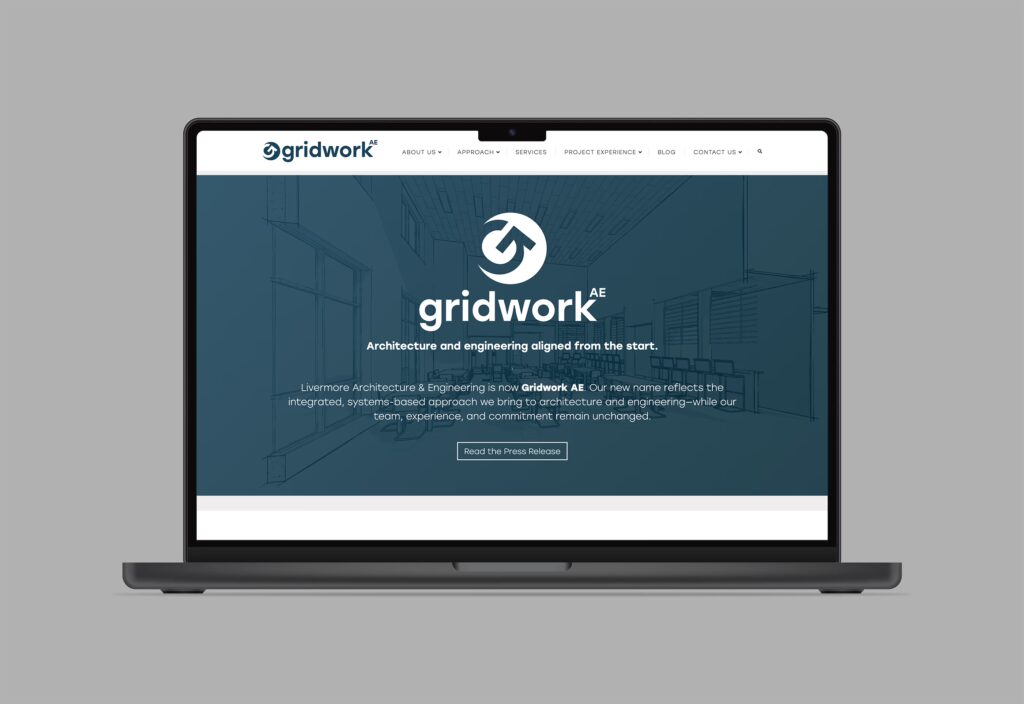
Studio Website
The Gridwork AE website received a light refresh to align with the studio’s rebranding.

“Erin and Brian brought structure, insight, and a steady hand throughout the process. They were consistently responsive, hardworking, and hands-on, and the end result of the rebrand exceeded our expectations.”
Results + Outcome
The rebrand gave Gridwork AE a clearer, more confident foundation for how the firm will present itself moving forward into the next iteration of the brand. With a new name, identity system, and aligned messaging in place, the team was able to launch the brand successfully and begin showing up in a way that more accurately reflects who they are and how they work today.
The response from their clients and the public was strongly positive, reinforcing that the new brand felt authentic, well aligned, and true to the firm’s collaborative, practical approach. Just as importantly, the project established a strong platform for future growth and evolution of the brand.
Ready for a brand that reflects who you’ve become?
We help organizations clarify their positioning and align their name, message, and identity so their brand connects more clearly with the right people.
About shop
We are Shop, a web design and graphic design studio based in Vancouver, WA. We’re a small group of designers, developers, writers, and makers who have banded together with the goal of creating beautiful design.