Jory
Design Strategy / UX Design / Application UI Design
Comprehensive Design, Modern Point of Sale
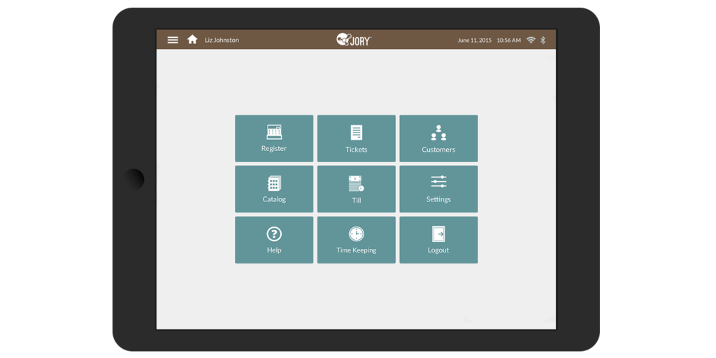
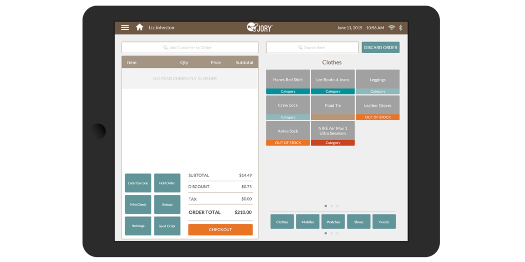
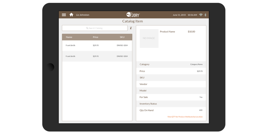
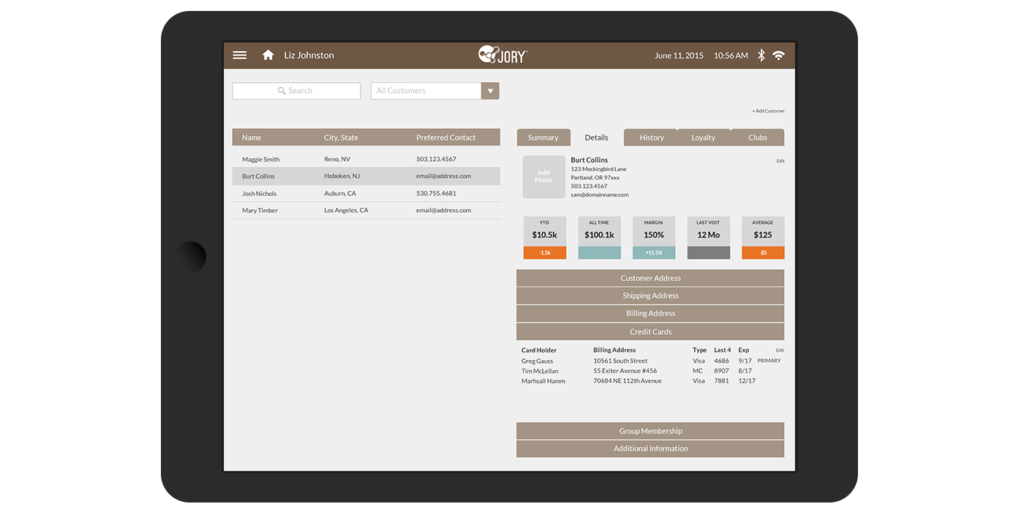
Jory is an improved mobile point-of-sale system that lets business owners help more people in less time. The application provides a robust inventory and catalogue management system that automatically updates all operational systems, regardless of their location. Jory provides a comprehensive reporting system that detailed business metrics at a glance letting companies how their business is doing at any given time.
We worked to develop a cohesive visual system that tied back to Jory’s brand objectives while re-enforcing a solid, meaningful, and engaging user experience.
Jory approached us to help define the visual look of their POS application screens. We worked to develop a cohesive visual system that tied back to their brand objectives while re-enforcing the user experience.
On the digital side our team worked closely with the Jory software developers defining the visual look for all interface elements used across the entire iOS application. The final graphical user interface system was applied to all 40 screens of the point of sale system in its first release, and for an additional 30 screens and features that were later developed.
Shop was also asked to design the brand identity for Jory in addition to designing the collateral systems that would represent the startup over time.
Design Strategy: Two Teams, Many Screens, One Cohesive Face
All UI design was the result of a collaboration between the our team and Jory’s development team. Throughout the course of the project we created dozens of individual elements, custom icons, ui screens, wireframes, and coded prototypes. We maintained an agile workflow in which assets were sent back and forth between both teams to rapidly develop the POS application.
Our two teams continued to work together as the team moved beyond the initial launch of the application, its testing, rounds of feedback, and a subsequent major revision of the system. The second version of the app concentrated on opening up space in the UI while creating a more immersive experience for clients and customers.


Plugging the Gaps With Custom Iconography
As with most user interface design projects Jory’s merchant application needed icons. We sources a series of standard icons that worked well for a portion of the UI, but as with most interface projects there are generally a few marks that would need to be custom made to handle the outliers, or specific functions, that weren’t represented in the standard icon set.
We worked with the Jory project team to design the series of custom icons to match the ones currently used in early versions of the interface. Through a series of sketching and design sprints we came up with a series of icons that filled the gaps in our set and had strong meaning for the functions they represented.
![]()
One Icon to Rule Them All
One of the best parts of an interface design project is when you finally get to create the icon for the application you’ve been working to complete. This tiny bit of iconographic design becomes the face for all the hard work you’ve developed behind-the-scenes. It’s important for the mark to work at various sizes—calling attention to the software while garnering interest from would be users. For the Jory POS application we utilized their hub style logo design and integrated it into a simple, but striking, two tone design featuring their brand colors: orange and white.