LVRKR
Logo Design
LVRKR (pronounced Lurker) was a northwest-based EDM project. The portland based duo was rooted in dubstep producing a variety of singles and playing extensively throughout the northwest region.
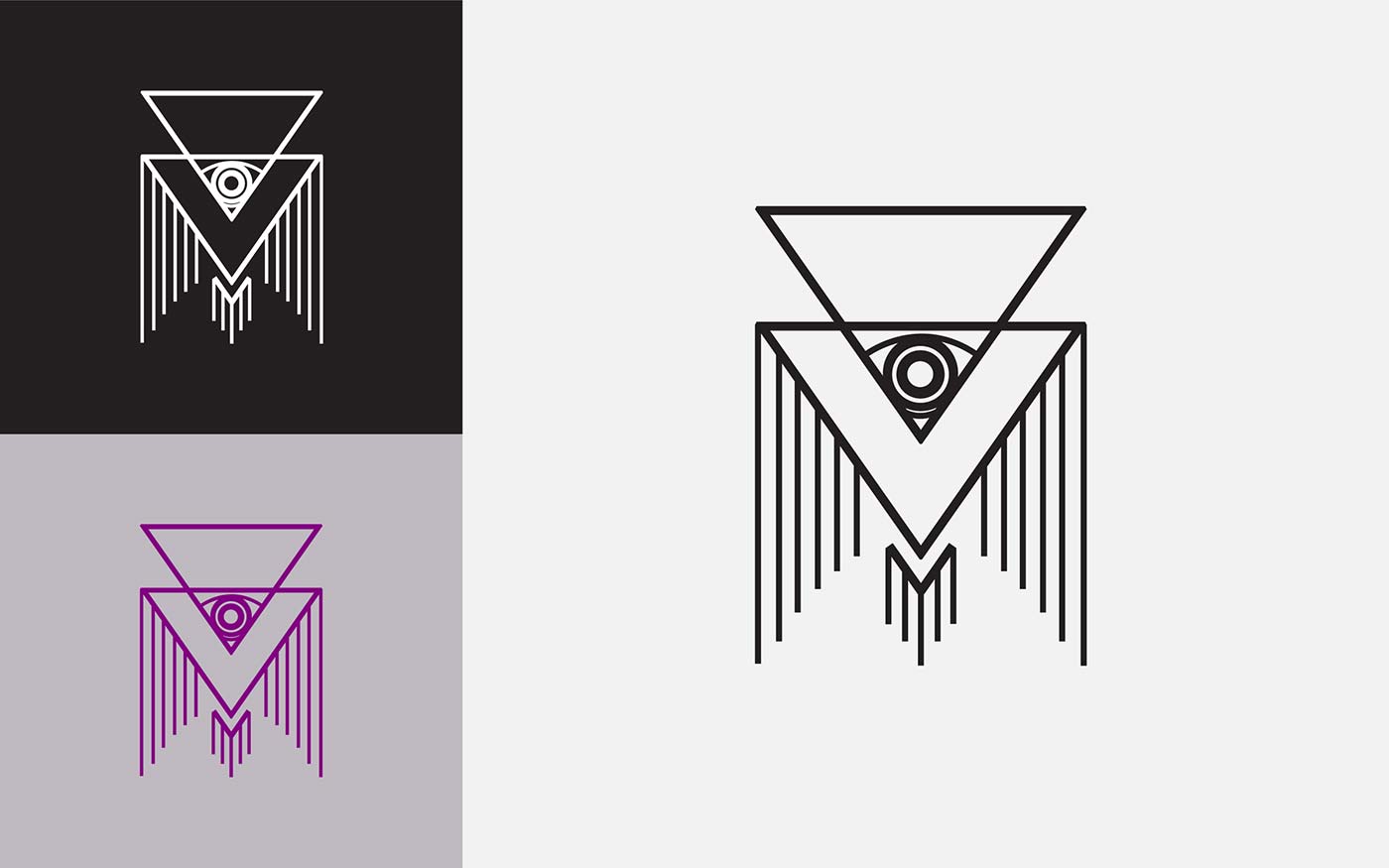
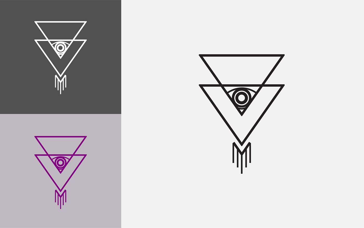
The LVRKR marks were designed to function as a kind of “kit of parts” with components that can be used individually or mixed together for a variety of effects.
We worked with the project’s co-founders on a series of marks that would help to refine and extend their brand. What we managed to unearth was a logo system that’s both versatile and representative of the dark electronic music they were known for.
Design Strategy: Establishing Identity through Variability
The logo was designed to function across multiple levels and acts as a kind of “kit of parts” with components that can be used individually or mixed together for a variety of effects. The main logotype uses modified type to create a clean, mechanical, modern look that represents the duo’s heavy technical sound.
The logo drew upon the concept of the “all seeing eye” and was developed with two variations. The compact, alternate version was created to be versatile enough to be used in situations when display space was limited.


